Ok so now we’re starting to add some real content and shape the look and feel of the website.
I’ve put these in a certain order but if you don’t have your logo or other content ready don’t worry, you can always come back and do these bits later.
In the menu click Theme Settings (this is located towards the bottom of the Admin menu).
There are 5 sections to the Theme settings.
- Theme Settings
- Theme Mobile Settings
- Blog
- Projects
- Social Media
Let’s go through each section …
Theme Settings
This is where you will upload your favicon, Touch icon, Logo and Retina Logo, set up your copyright details and a couple of other options.
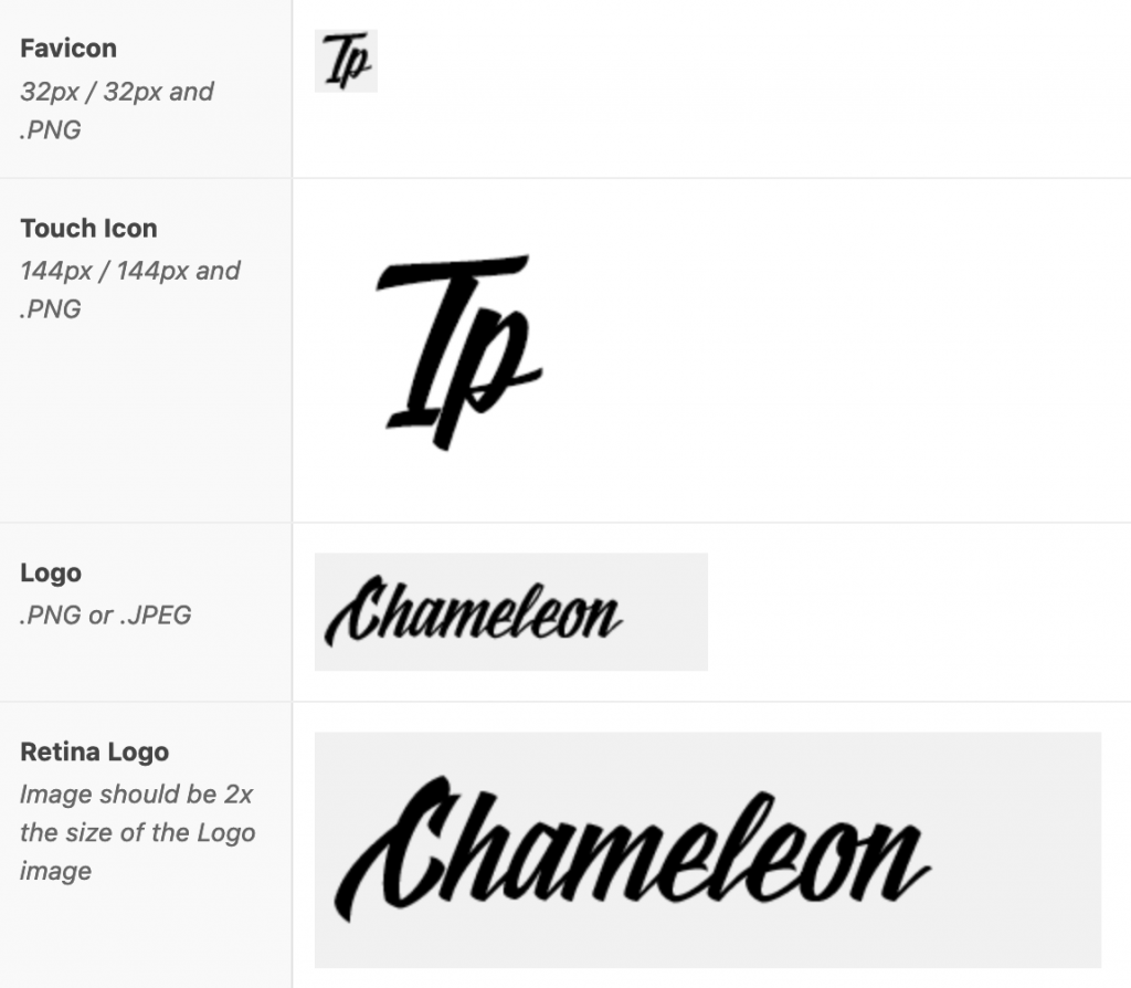
Favicon: A favicon, or shortcut icon, is a very small image that can be seen next to the URL and next to bookmarks in your browser as shown below:
Touch icon (for apple mobile devices): Similar to the Favicon, the Touch Icon or apple-touch-icon.png is a file used for a web page icon on the Apple iPhone, iPod Touch, and iPad. When someone bookmarks your web page or adds your web page to their home screen, this icon is used.
Your Logo: If you already have a logo at the size you want it to appear on your website, great. Otherwise you’ll need to create or resize it and save it as a JPG or PNG file. Have a look at your website to determine the size you think your logo should be. You might have to upload it a couple of times at different sizes to get it to look just right. The optimum size is 250 x 60px – if you make the logo too high it will push the header down and cover part of the page content so try to keep it around 60px high.
Retina Logo: The retina logo is required so, when visitors view your website on a computer with a retina screen which displays a higher resolution or number of pixels, your logo won’t appear blurry. Size should be exactly double your existing logo size.
Copyright: Entering your own copyright details here will overwrite the theme copyright details.
Header width: Setting this determines the width of your header – i.e. your logo and menu width across the browser.
Header content: Only the search option is applicable – the other two should not be turned on unless you install WooCommerce – this module does not contain any WooCommerce set up information.
Theme Mobile Settings
Mobile Logo: if you want to display a different format of your logo for mobile you can do that here
Show Mobile Menu: Displays the ‘Hamburger’ style menu on phones or both phone and tablets
Menu Content: You can decide which of these options you wish to display on a mobile device
Mobile Menu Text: this text will sit below the Mobile Menu and Social Icons – a good spot to put your address and contact details.
Blog Settings
Blog Type: set the appearance of your blog – List or Masonry.
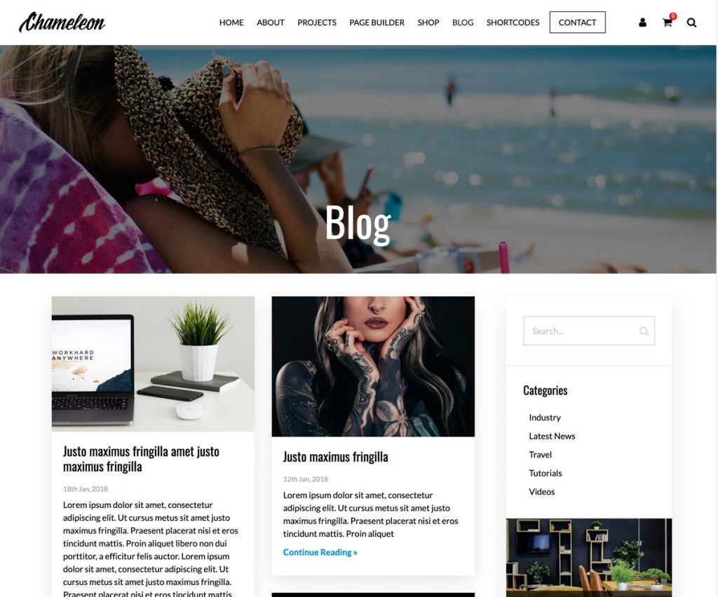
Masonry view
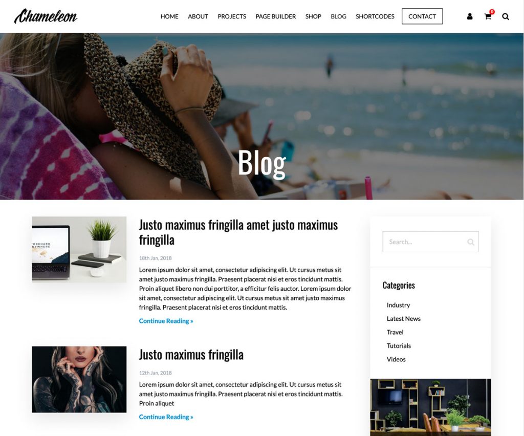
List view
Post Meta: Choose what you wish do show on each blog – Date, Author etc
Share Buttons: Select the social platforms you wish your users to share your content on
Sidebar: Various options for the displaying of a sidebar on your blog pages
Projects
Projects Title: Your projects are a type of blog – each project page will show the heading you set here – i.e. Portfolio
Project Slug: Leave this blank unless you want to override the default
Category Grid: Set a 2, 3 or 4 column grid for your project categories
Display Meta: Choose which information you want displayed on each page
Social options: for allowing your visitors to share your projects on their social platforms
Social Media Settings
These are links to your Social media platforms – enter the relevant URL as desired – this will activate the icon to appear in relevant areas.
Currently the following platform icons are available:
- Google Plus
- Tumblr
- Flickr
- YouTube
- Vimeo
- DeviantArt
- 500px
- GitHub
- Houzz